Case study: Website revamp for a tour guide

About Wanderer Footsteps
Said, a professional tour guide was an interior designer who had always dreamed of traveling the world and experiencing new cultures. He then started offering guided tours to interested people.
He was so good at it that he decided to make it his full-time job. He then created Wanderer Footsteps, a company that offers guided tours in France. He was curious to dig in and create his website using a no-code tool: WordPress. He did it all on his own, and it was impressive.
But as his business grew, the website started becoming a hindrance because the templates offered by WordPress were not fully customizable, and the experience of a UI/UX was needed. He came to us to revamp his user interface and website performance.
Let’s explore the pain points his clients were experiencing.
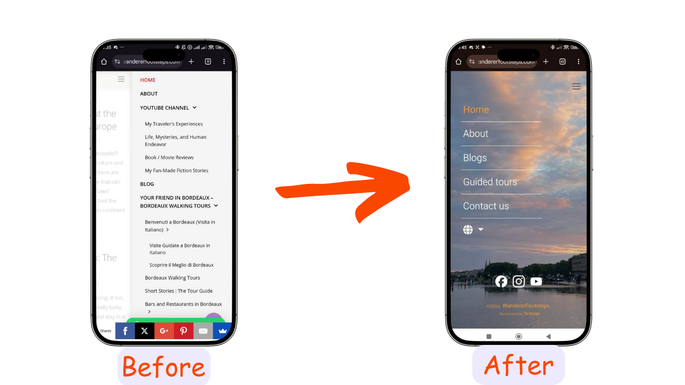
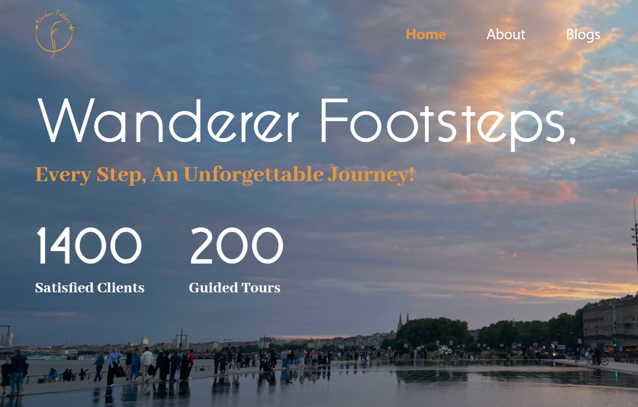
Menu
In his old version, he had lots of links that he placed in the menu. The issue with that is that they didn’t have any hierarchy, so it ended up confusing visitors
The solution was to have fewer links, organized intuitively with clear titles.
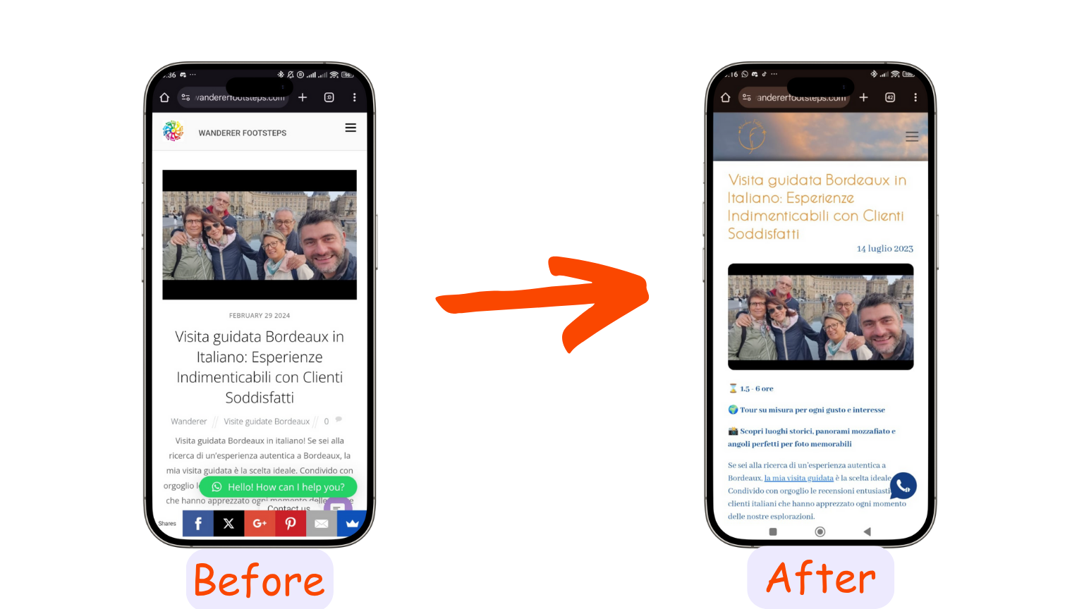
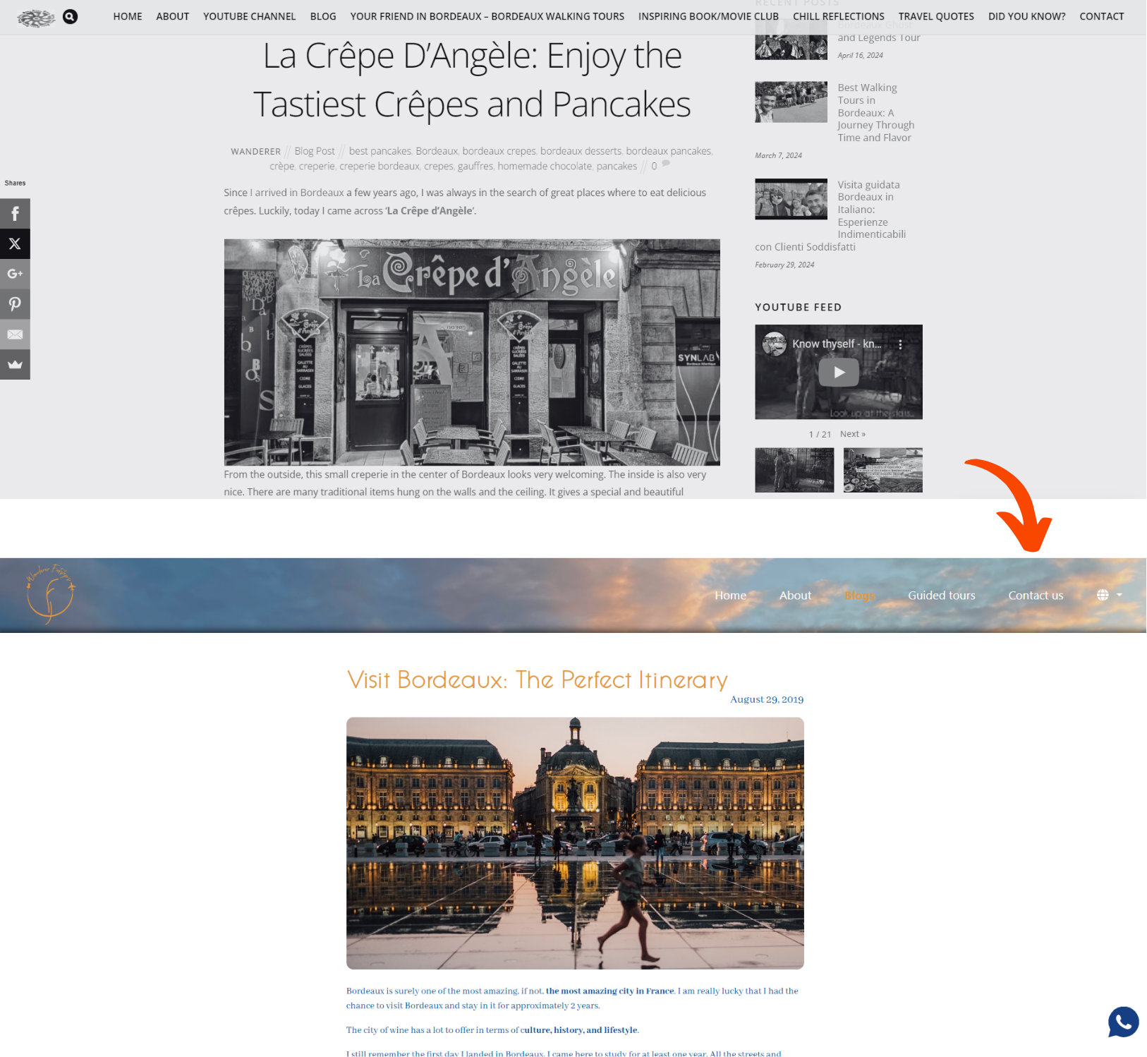
Blogs
Said had great blogs, extremely well written and captivating, but their charm was stripped away by the display that took away their charm
On mobile, there were way too many links hiding more than half of the page, which made it difficult to enjoy the stories. He had to put in his social media links, so we changed the design to include his socials in a footer that does not display over the blogs.
As for the desktop display, many distracting links needed to be removed to allow users to focus completely on the content. This ensured that the attention was completely directed to the content, and the experience that Said wanted to deliver was the sole focus of the visitor
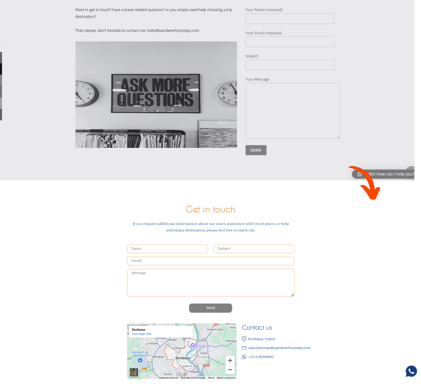
Contact page
It’s great that this founder thought about having a contact form to receive inquiries and leads from his website, but he missed something. Not all people like to fill up forms, some just want to send an email or give them a call. He did not include any phone number, and his email was well hidden.
In addition, since he is a tour guide, it was necessary to set up the city where his tours took place.
Personalization
Wanderer Footsteps had mostly clients from different origins: France, Italy, the United Kingdom, USA… Not all of them knew English. This made him miss many clients since his website was solely in English. This is why it was important to have the website in different languages, aiming at his growing target audience: French, Italian, and English.
Identity
Last but not least, the whole branding was missing an identity, something that would make you think of Wanderer Footsteps as soon as you see it. It was a logo and a color theme.
For the traveling industry, he needed something joyful. What better than the colors of the sky and the sun? Golden orange and blue were the choices immediately approved. As soon as you hear the word travel, you think of flights, a clear blue sky, and a bright sun. They also fit Said’s energetic vibe and adventurous spirit.
Concerning the logo, it contains a lot of hints about traveling and heritage. The main components are the letters “W” and "F" which stand for Wanderer Footsteps. They are in old Latin characters, representing the heritage that Said explores to prepare his tours.
On both sides of the logo, there’s a pin and a plane, highlighting the travel aspect of the company. An old pin was used instead of the modern map pin to keep the nostalgic vibe of the old paper maps.
Summary
Revamping the Wanderer Footsteps website was a great experience. It was done from logo to identity, through content, design, user experience, and personalization. To correctly target the audience you are seeking, there are lots of details to be taken into consideration, and that’s why you most probably need people with experience to do it once the business starts to grow.